Responsive Website Redesign - Koomi Yogurt:
Designing a Seamless Ordering Experience to Enhance Koomi Yogurt's Online Presence
Role
UI/UX Design
Timeline
5 weeks
November 2021
Team
Sole UI/UX Designer
Tools
Figma, Photoshop
Miro, Notion, Airtable
Context
Disclaimer
This website redesign project is an independent initiative and is not affiliated with the Koomi brand. All photos are sourced from the Philippine franchise system.
Background
Koomi, an Australian-origin franchise with 30 stores in the Philippines, offers natural drinking yogurt made with probiotics and fresh ingredients. Koomi's primary business goal is to maximize brand recognition for each franchisee, both online and offline.
Problems
Outdated content on website
Although Koomi actively engages with customers on Social Media and has its own responsive website, the website provides outdated information about products and price.
Uncategorized menu causing mental load
Featuring more than 20 cups of different flavors without a global search or filter features causes more than 20 times of scrolling down to find the options on mobile device.
No online ordering experience on its own website
Cannot make sales from its own website. Totally depends on delivery apps with 30% profit-sharing.
Offer offline membership card only, hence users cannot redeem perks through any online purchases.
Solutions
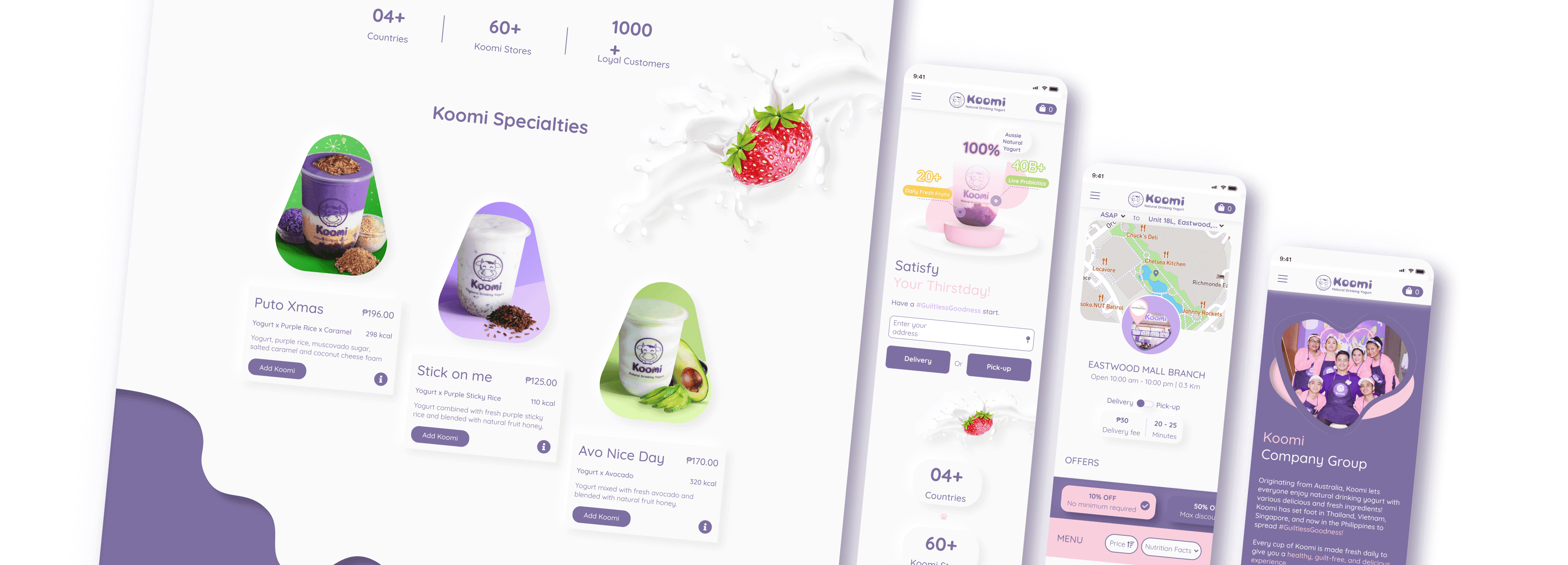
Redesign a responsive website for Philippines franchise system
Revamp the responsive website by adding spices to the original UI.
Update the content to date & set UX writing tone which matches the brand concept.
Categorize menu items with real-time tracking on availability by each location
Show menu of the specific branch once a user location is known.
Categorize items & create filter chips by needs for faster browsing.
Create online ordering experience
Build up a hassle-free and seamless experience from scratch.
Generate Paws & Perks system to retain loyal customers.
DESIGN THINKING FRAMEWORK
I began with a design thinking approach, validating our hypotheses through research before moving to solutions. Here’s a look at our process.
Secondary Research
Methodology:
Stakeholder Research
Market Research
Competitor Analysis
Objectives:
To understand F&B industry before, during the Covid-19 & market predictions after the pandemic.
To learn from the direct and indirect competitors' strengths & weaknesses in building a responsive website.
Key Takeaways:
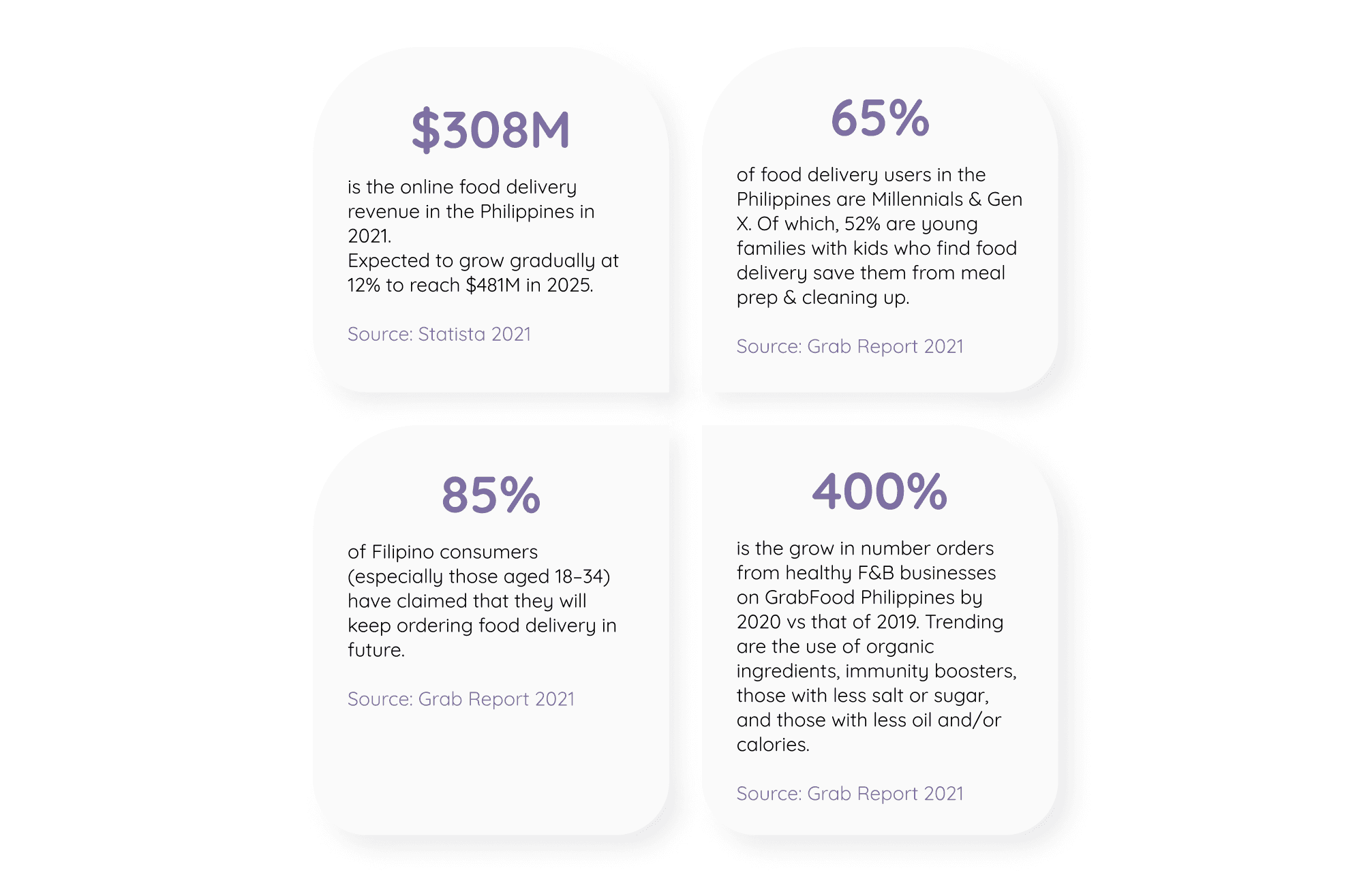
The pandemic has boosted the demand for online F&B delivery and this trend is expected to grow in the new normal.
→ This is an opportunity for Koomi to boost more sale by increasing their online presence across platforms.
The majority of F&B delivery users in the Philippines is young adults who do not have enough time to prepare meals.
→ Koomi should provide a hassle-free experience to meet the need of target customers who are considered as Millennials & Gen Z.
The pandemic has shifted Filipino's eating habits to a healthier manner which drives the consideration of organic ingredients and calories, sugar intakes.
→ Koomi should take advantage of their organic products and disclose nutrition facts of each item in details.
Most of F&B businesses in the Philippines show strong brand identity by applying consistent & decent visuals.
→ Strong & consistent branding identity across platforms will do wonder for communication between brand and users.
Most of F&B businesses' own platforms encounter more limitations compared to 3rd party apps which can offer more user-friendly experiences such as Live-tracking, estimated distance, etc.
→ Koomi can learn from the apps 's design pattern while consider the constraints of the platform to eliminate user's mental load.
Market research insights
Primary Research
Methodology:
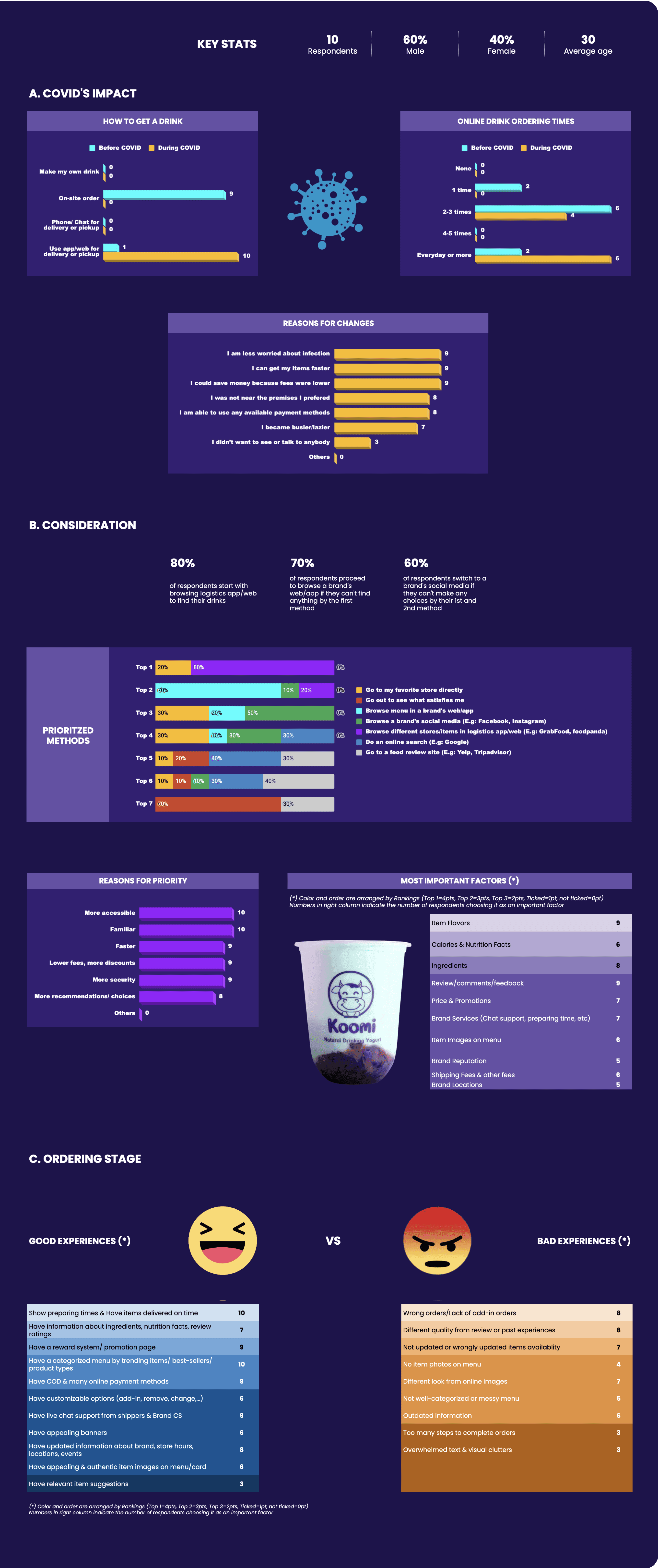
The survey conducted offline with 10 participants includes 09 Questions which require both verbal and written answers.
By doing so, I can garner quantitative & qualitative data thru both numbers & observations to ensure a deep understanding of how is their online food & drink ordering experience. Please find the detail of Survey synthesis here.
Objectives:
To understand what are users' pain points, needs & motivations in choosing what to drink & thru which distribution channels.
To understand what are users' pain points, needs & motivations in online F&B ordering.
To Identify key components necessary for online F&B ordering.
Assumption validation:
People have switched from going to on-site ordering to online platforms with an increase in number of orders since the pandemic hit.
➔ 10/10 participants opted for online ordering instead of offline purchase at physical stores since covid hit. Also, the frequency of online ordering has accelerated from 2-3 times before COVID to 7+ times during COVID.
Among online platforms, people prefer logistics app/web over a brand's web/app because of the accessibility and familiarity. Thus they expect a brand's online platforms to feature the same.
➔ 8/10 participants chose logistics platforms as their first go-to method. A brand's web/app came as the 2nd choice.
➔ 10/10 participants picked accessibility and familiarity as Top 1 & 2 reasons for that priority.
People expect to have a streamlined ordering process and similar key components with logistics platforms.
➔ 10/10 participants named logistics app as the most accessed platforms for ordering drinks and it takes 4-5 familiar steps to complete the order.
Survey synthesis
User Persona & User Journey Map
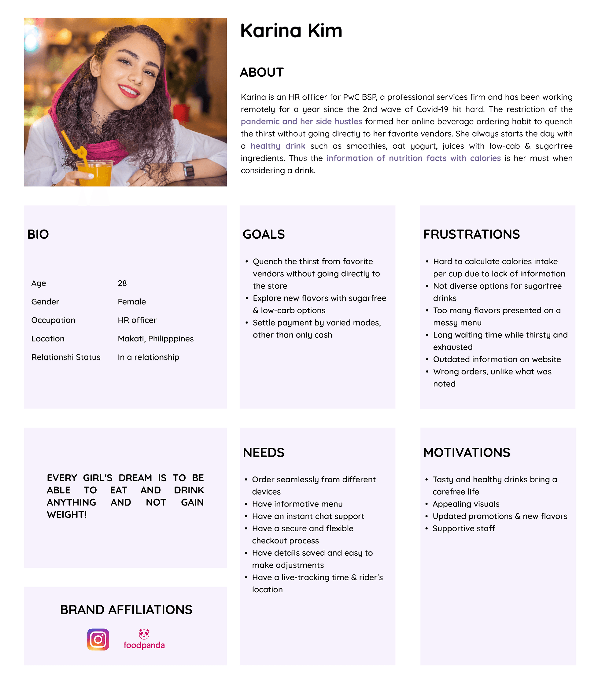
Let's meet Karina Kim - the one was created to represent key audience segments. Forming a user persona did help focus on addressing the most critical pain points that the most important user group are facing.
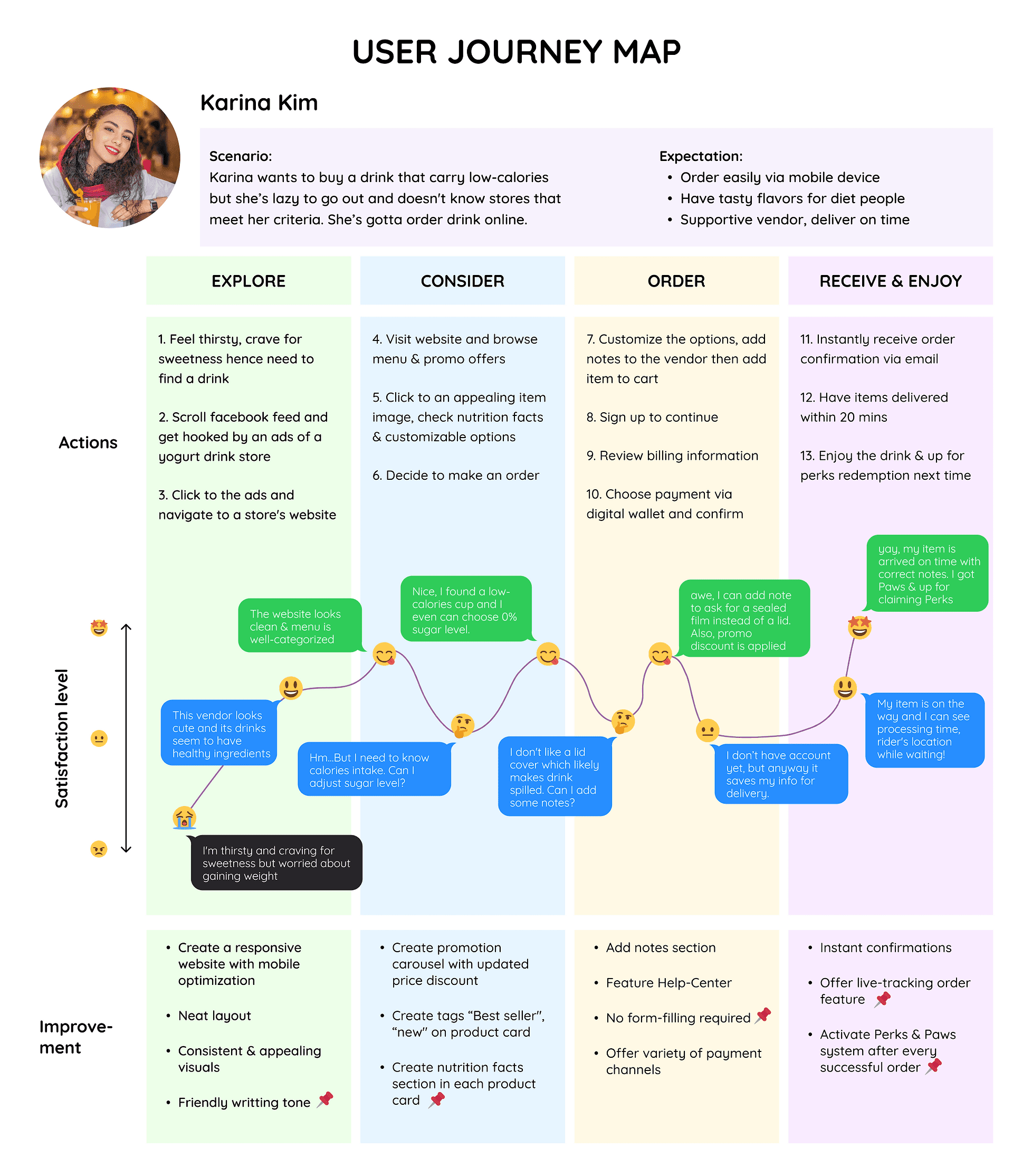
In order to visualize how Karina Kim feels & interacts with the brand's website during the process of online ordering, the user journey map was also created.
Problem Statements & HMW
Let's frame the problems thru a series of Karina's Need Statements. Once the challenges had been known, the correspondingly innovative solutions, How Might We questions, were constructed for later-on-brainstorming session.
The Problem Statements could be formed thanks to the insights from User Research Findings. Please find the details here.
How Might We Questions:
#1. How might we categorize menu into different tabs to suit Karina's expectation?
#2. How might we design a description section in each product card with all details Karina wants to know but not too crowded with text?
#3. How might we create a tracking status that lightens her mood while waiting for a drink?
#4. How might we create an auto and simple guidance of the most frequent concerns?
#5. How might we design a streamlined ordering process that helps Karina order drink at ease across varied devices?
#6. How might we create a seamless checkout process which offers different modes of payment?
Feature Roadmap
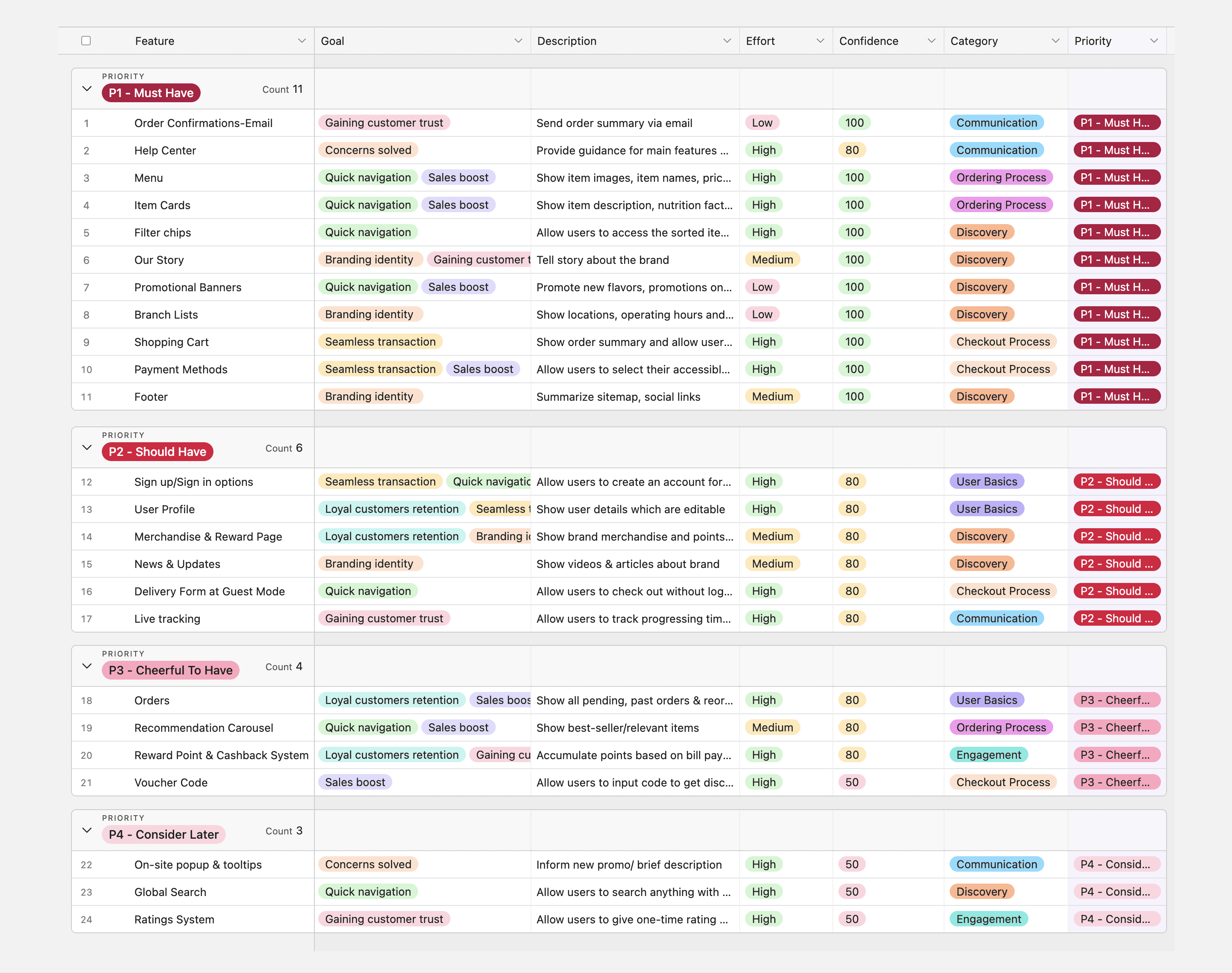
The roadmap of the potential features was constructed to have a big picture of which components should be built first given the priority & user's needs thru out the product lifecycle. Please find the details here.
Feeature Roadmap
Sitemap
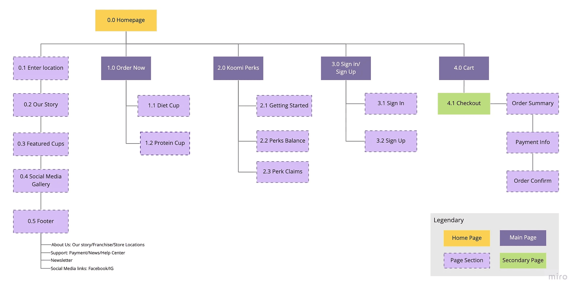
It's time to connect the dots! The features built from Step 2 were structured into the most important page content. The goal of the sitemap is to provide a shortcut across the entire website.
User Flow
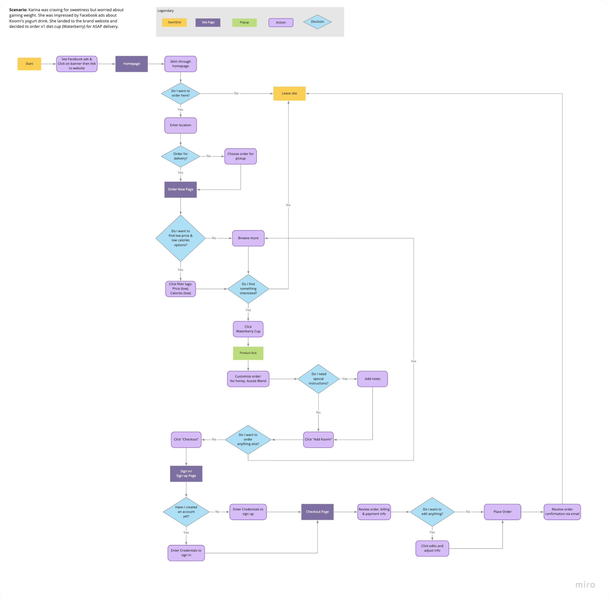
Next, let's see how Karina would interact with Koomi's website under the specific task which was identified by her own goals.
Sketch & UI Guide
The sketch version and findings from user research & competitor analysis did help construct the wireframes digitally with Figma.
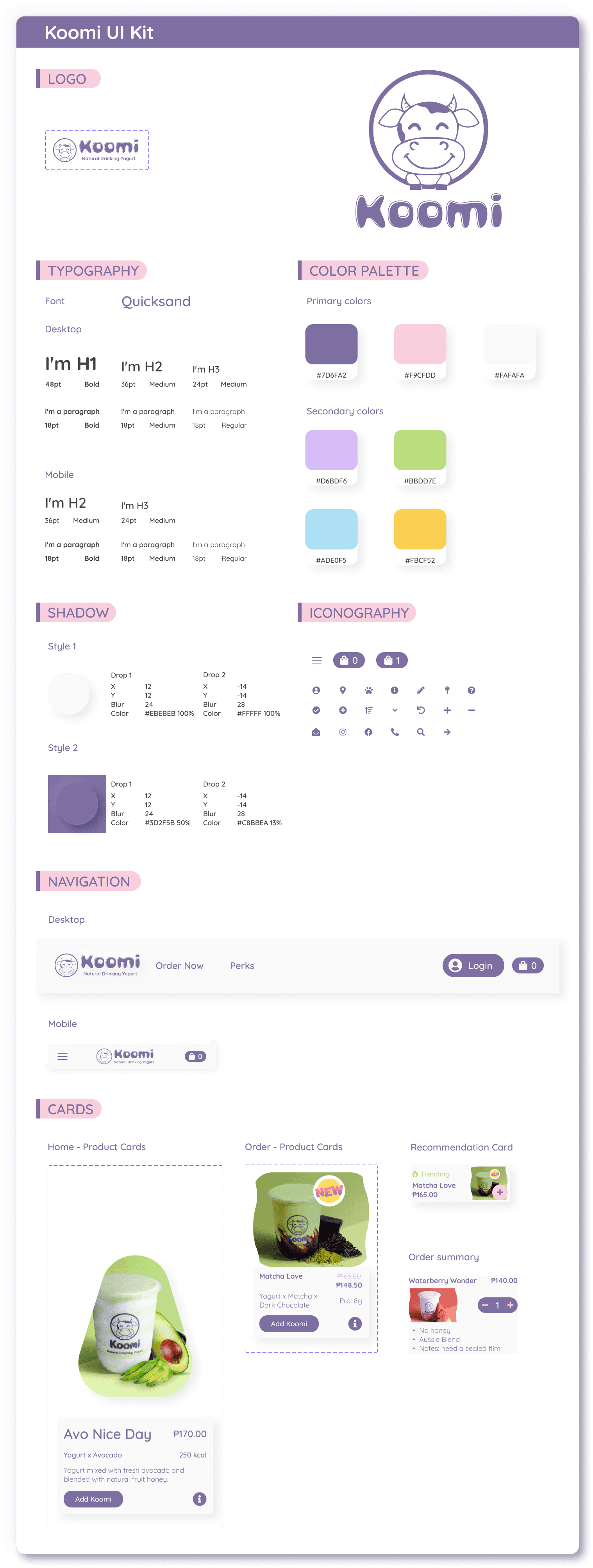
Indeed, a UI Guideline is the first step when it comes to creating high-fidelity wireframes. The UI kit aims to not only maintain the original which brings up the light-hearted & sweetness vibes but also revamp its look with some outstanding add-ons.
Logo: Including 02 parts, the brand's name was redesigned to create some soft curves which interestingly matches the shape of cow spots. Meanwhile, the mascot was remained unchanged to be consistent with product images.
Neumorphism effects: Setting of 02 shadows, one at positive value and the other at negative could achieve a soft extruded-like surface. This effect applied on white card can give a sense of a creamy & thick texture similar to yogurt's.
Glassmorphism effects: Adding a background blur in a low-opacity fill can reach the frosted-glass effects.
Usability Testing
Using the user flow as a guide, I developed a hi-fi prototype for both Desktop & Mobile.
Objectives:
Grasp what challenges users face with when they try to finish the tasks: web navigation, adding items, ordering.
Explore what would be the barriers for any challenges.
Obtain insights from testing for essential improvements.
Methodology:
1-on-1 & in-person usability testing
05 participants
26-44 yrs old (target group)
Habit: Order food/ drink online 4 times per month
Scenario:
You are craving for sweetness but also on a diet. Thus you cannot have sugar intake and high calories food or drink. While browsing Facebook, you got hooked by an ads then click the button to land to Koomi's website. Could you show me how you order the low price and low cal drink named "Waterberry wonder" for delivery?
Test Results:
Completion rate: 100%
Error-free rate: 80% (01 user clicked Pickup button instead of Delivery to proceed to Order page).
Key Takeaways
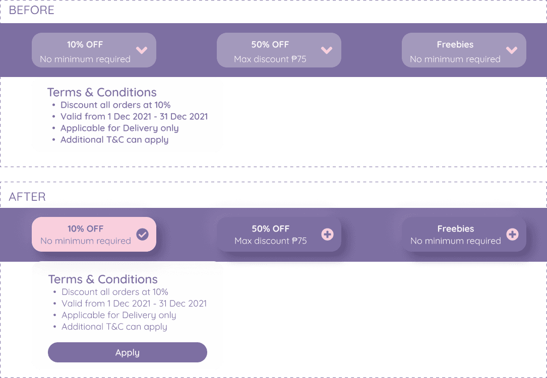
#1. Ordering Process: Promo Display
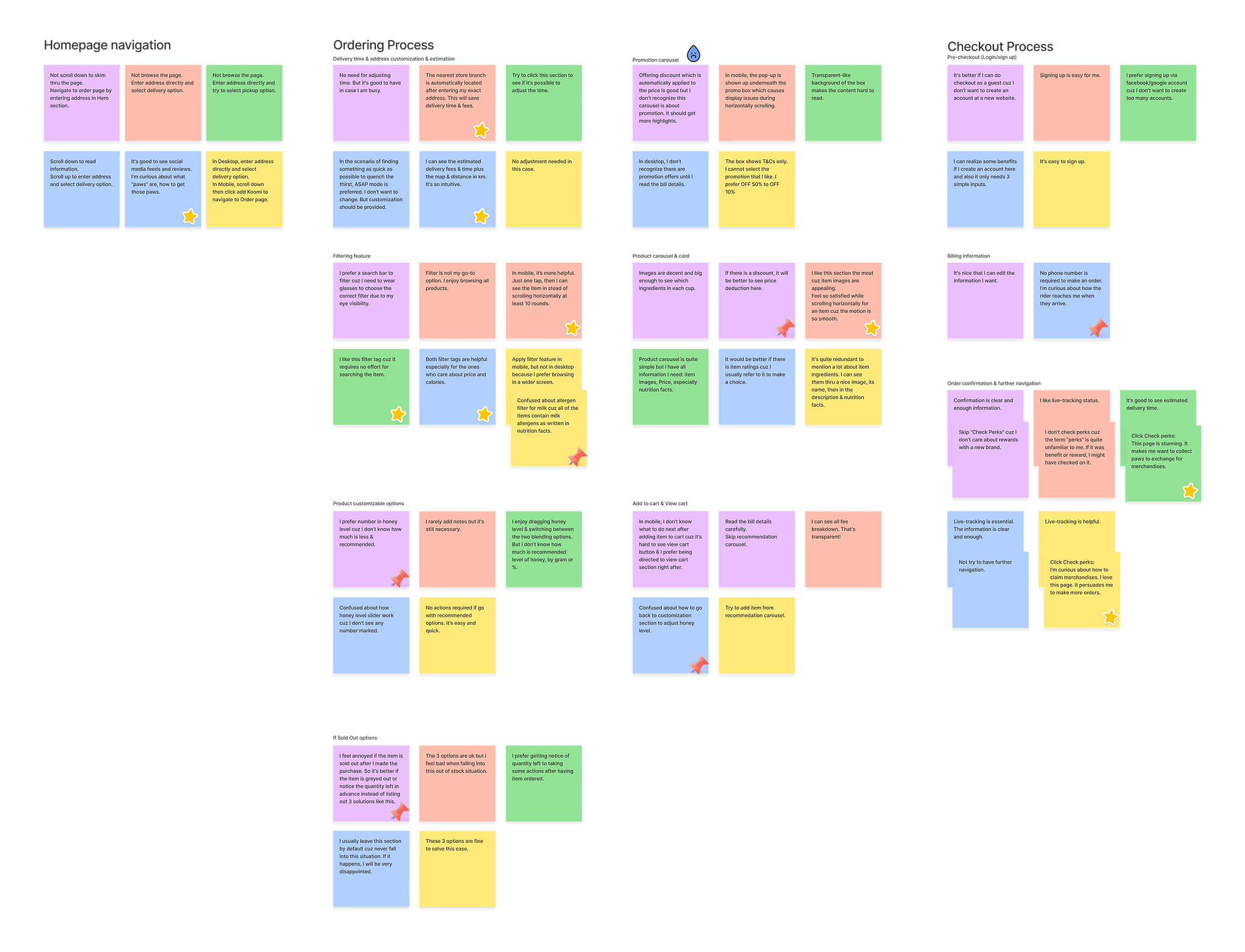
3/5 could not recognize promotions offered until they read bill details. One is confused how to select the favorite promotion. One indicate the pop-up display issues in mobile when scrolling horizontally.
Area for improvements:
Change promo box fill.
Add "Apply button" on pop-up and once applied, the promotion box turns to a different shade.
In mobile, replace the existing pop-up by the one pushed in from the bottom of the phone.
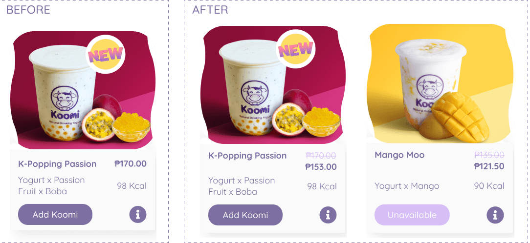
Show the price deduction on product card to inform customers about discount promo.
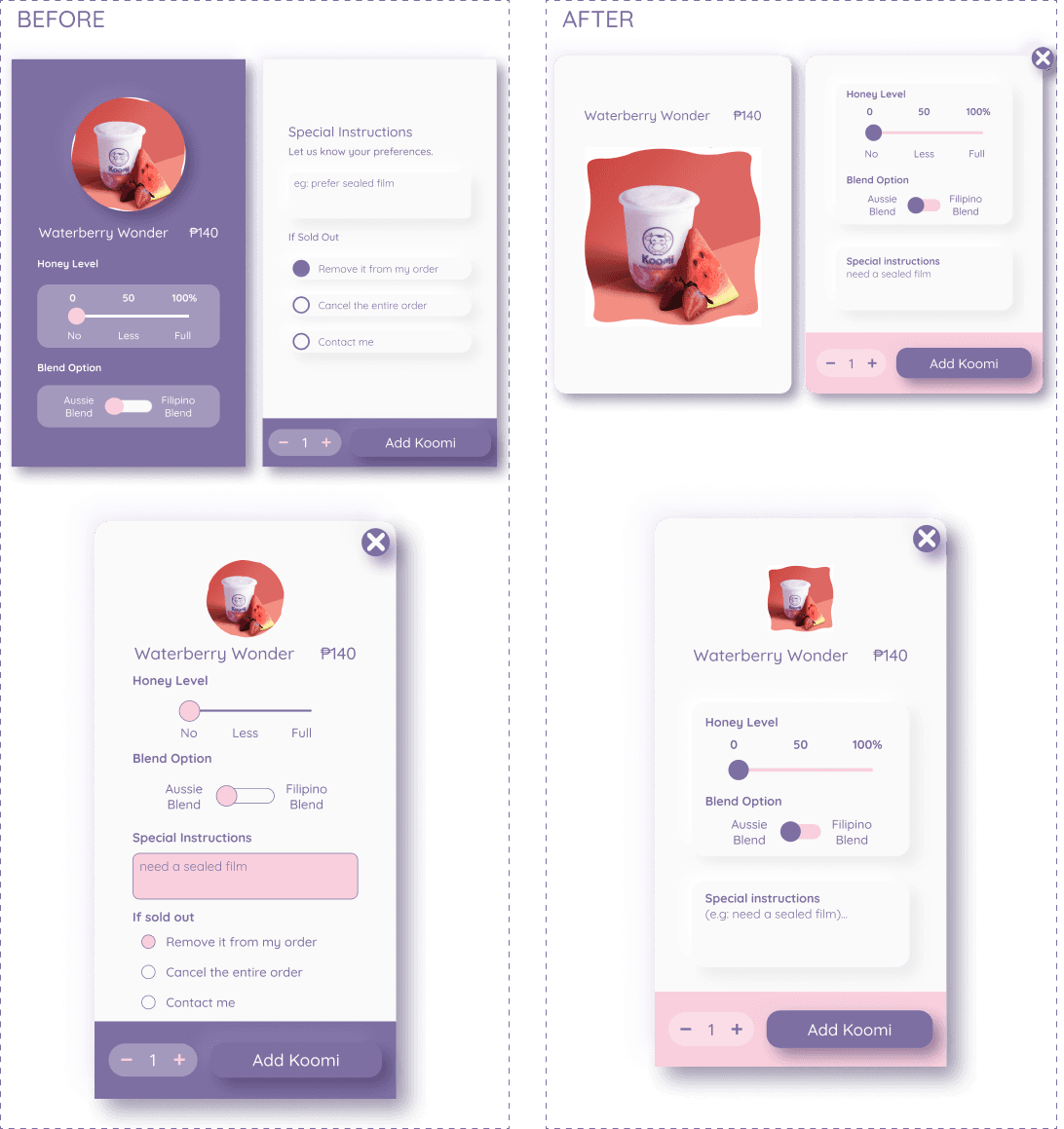
#2. Ordering Process: Customization Card
3/5 got confused about the amount of honey level. One asked about how to get back to customization section after adding the item to cart in mobile.
Area for improvements:
Add number marked into honey level slider.
Add navigation to get back to customization section from view cart section.
#3. Ordering Process: Product Card & Cart
3/5 need an advance notice of available quantity in real time rather than the 3 actions listed in "if sold out" section. They all feel annoyed if the situation happens after they successfully order an item.
Area for improvements:
Grey out the sold out items.
Remove "If sold out" section.
#4. Checkout Process
One questioned about how a rider can reach their customers without a phone number or chat message.
Area for improvements:
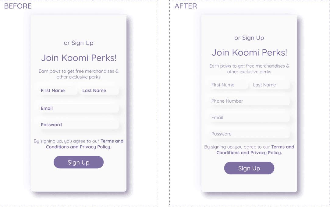
Add an input of phone number required in sign-up form
Affiniity Mapping
Revise The Design
#1. Promotion Box
Change Glassmorphism to Neumorphism card to give content more contrast
Add "Apply button" on pop-up and once applied, the card turns to pink with checked icon. Otherwise, cards remain purple with plus icon.
In mobile, replace the existing pop-up by the one pushed in from the bottom of the phone.
#2. Product Card
Show the price deduction on product card to inform customers about discount promo.
Apply light shade on the one unavailable.
#3. Customization Card
Remove "If Sold Out" section because only the available ones can be navigated to the customization.
Add number (%) marked into Honey level sliderAdd navigation to get back to customization section from view cart section.
#4. Checkout Process
Add an input of phone number required in sign-up form to help save billing information for later checkout.
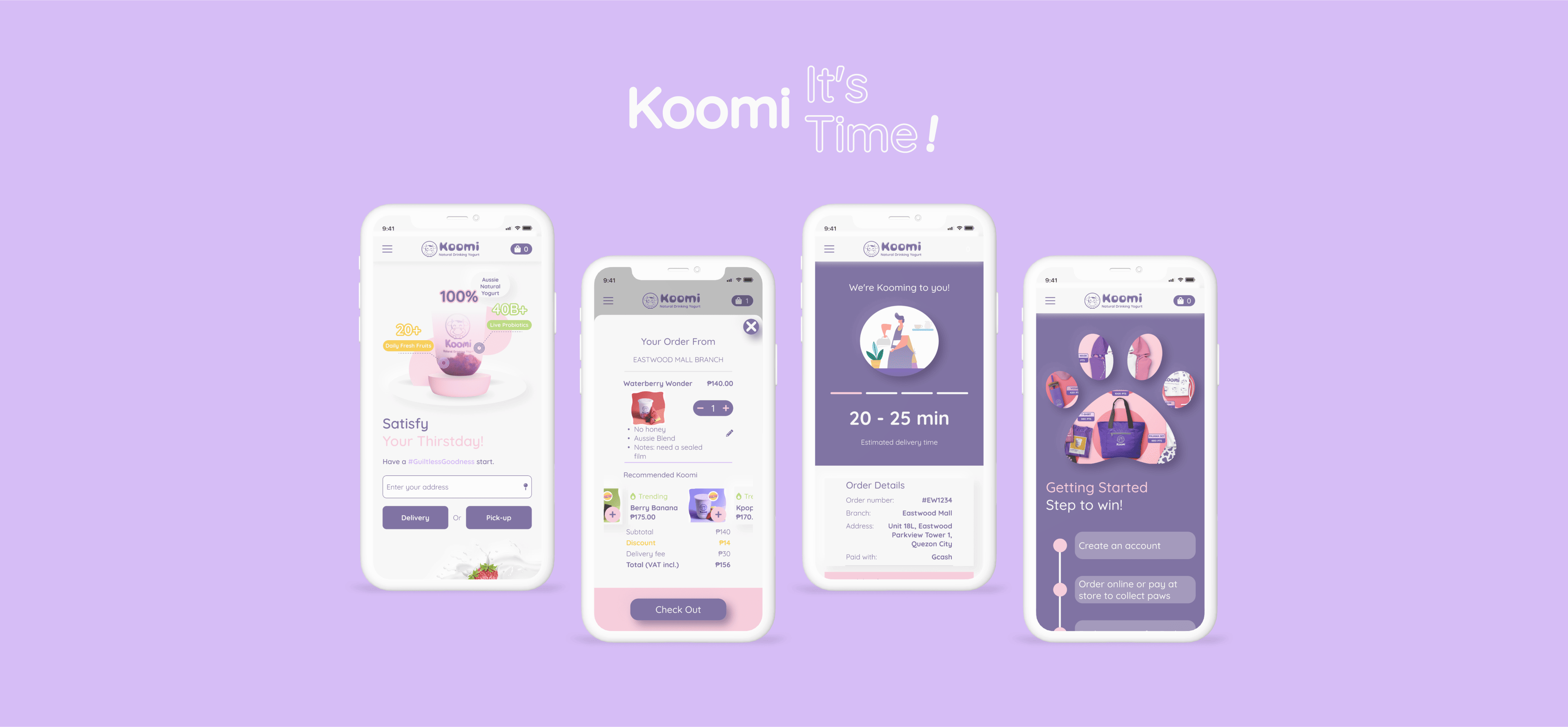
Redesign Homepage
Food Ordering
Checkout
Perk System
CONCLUSION
What I have learned
Engaging with real customers to ask questions, observe, listen & take notes during interview session did help me gain a great deal of information which then served as insights for generating practical solutions.
Testing with high-fidelity prototype was such a game-changing step. With a couple of adjustments on colors, effects, the size of buttons, the new interface had been improved considerably which would been hard to achieve with low or medium-fidelity prototype.
Last but not least, I have accumulated the following qualifications through out the project:
Problem-solving skills was observed all times. Whenever an issue was found, I tried to list out as many solutions as possible
Design-thinking mindset was improved thru each step
Self-study from all available materials by engaging design community group on social media, tutorial videos on Youtube, etc
Self-discipline to commit myself to spend at least 3 hours per day to complete the project
Multitasking and working under the pressure since I worked as a solely designer in the project
Next Steps
Due to the time constraints, only 01 round of usability test was conducted.
→ I expect to conduct another round to test whether all the user pain points have been effectively solved.
The current outcome incorporated most prioritized features. Some at the lower levels should be employed to bring the user experience to the next level.
→ Revise feature roadmap & prioritization matrix to come up with new solutions with new added features.
This is the non-commercial project for Koomi - a franchisee of a parent company in Australia. Thus the project was not validated by the stakeholder and no handoff process was involved.
→ I will try my best to reach the stakeholder to get validation and hope the solutions can add some values to their organization.
